
Featured Work


CASE STUDY: MightyWell
|
Client
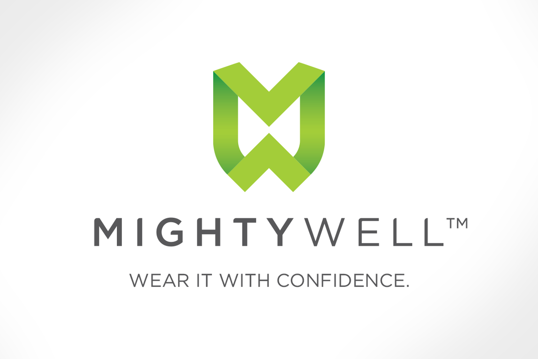
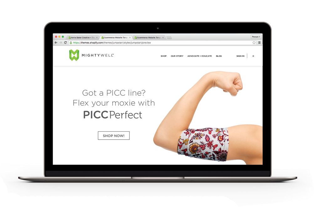
PICC Perfect Scope Full Rebrand Services Naming Brand Platforming & Architecture Logo Design Package Design Web Concepting Copywriting Having had enormous success with its initial offering (a discreet, hygienic, and sporty PICC-line cover), the team behind PICC Perfect, sought to leverage its traction and marketable core values in a broader medical accessories market, but was hemmed in by its product-specific brand name.
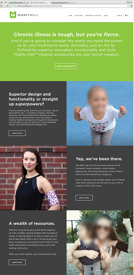
Borne of its Founder/CEO's 9-year battle with Chronic Neurological Lyme Disease, the PICC Perfect product was conceived and designed to keep PICC-line patients on-the-go and focused not on the burden of illness or treatment, but on living life to the fullest. By renaming the company Mighty Well (which shifted the focus away from illness and onto the ideas of strength and wellness) and reinventing PICC Perfect as a product brand beneath it, a new brand architecture was born, providing unlimited opportunity for product line expansion. Additionally, by building the brand platform around CEO Emily Levy's personal experience, the brand authentically assumed her compassion, sense of humor and fighting spirit, allowing it to an make emotional connection with its audience. 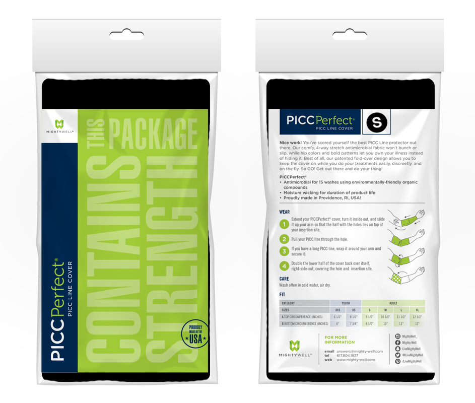
|
|
CASE STUDY: The Women's Bar Association and Foundation
|
Client
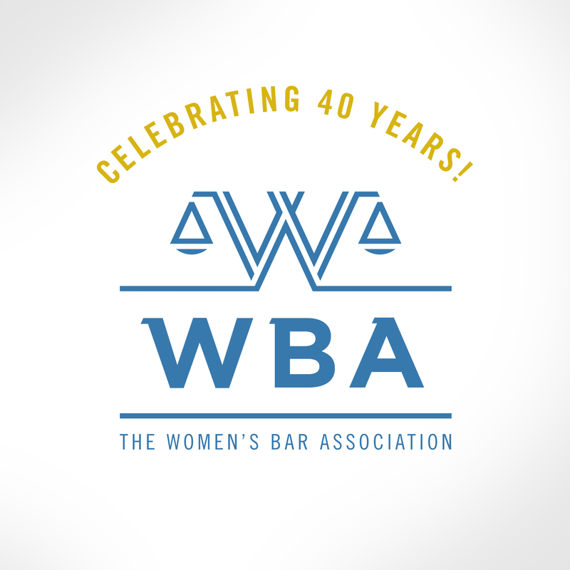
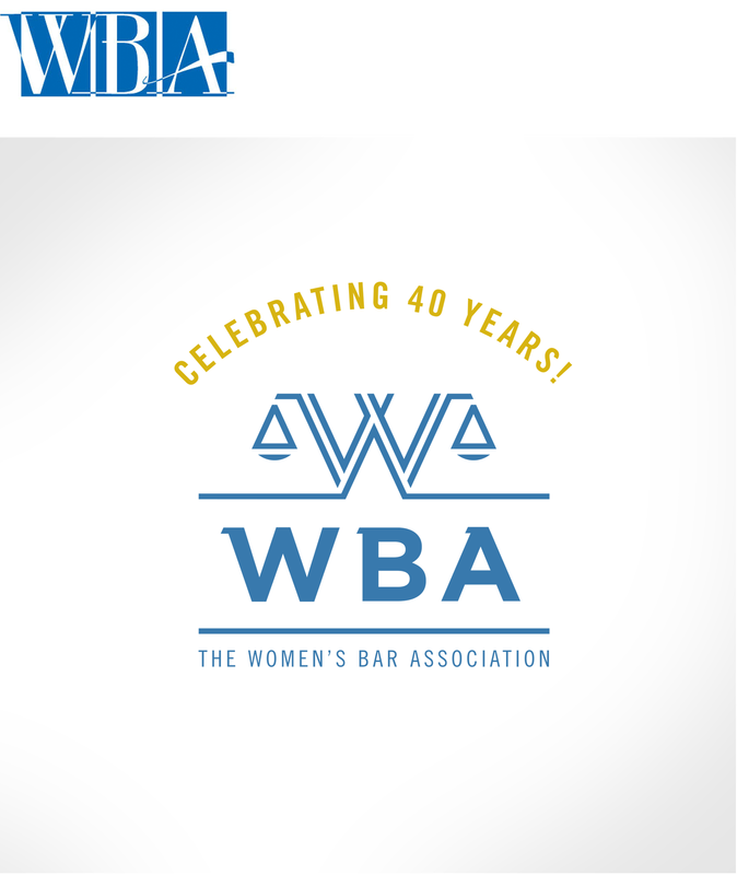
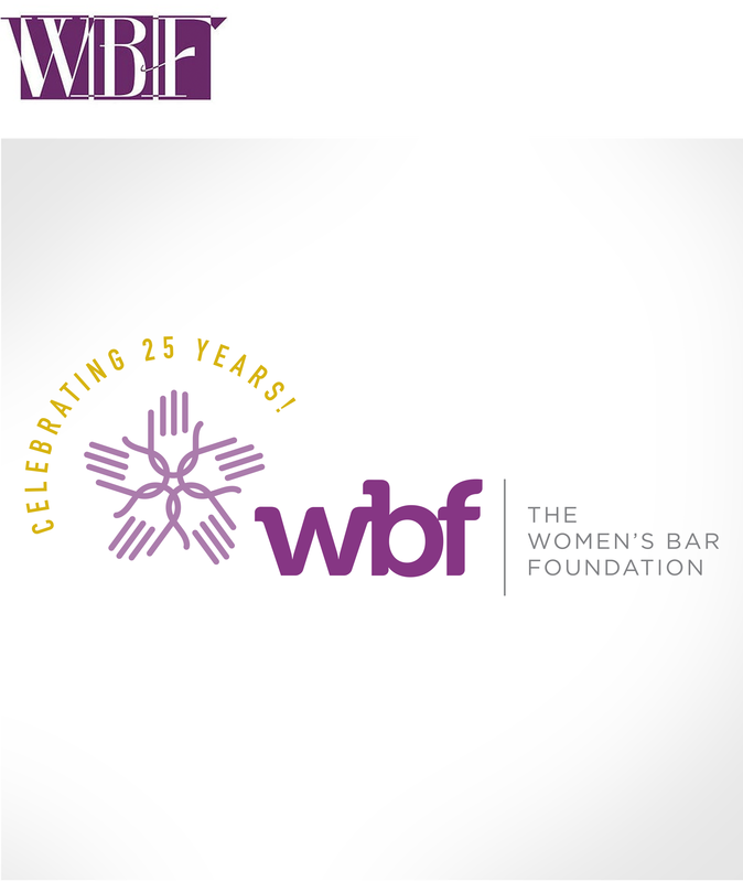
The Women's Bar Association of Massachusetts The Women's Bar Foundation of Massachusetts Scope Rebrand Anniversary Year Logo Variations Event Branding & Communications Services Logo Design Print Layout Design Copywriting WBA
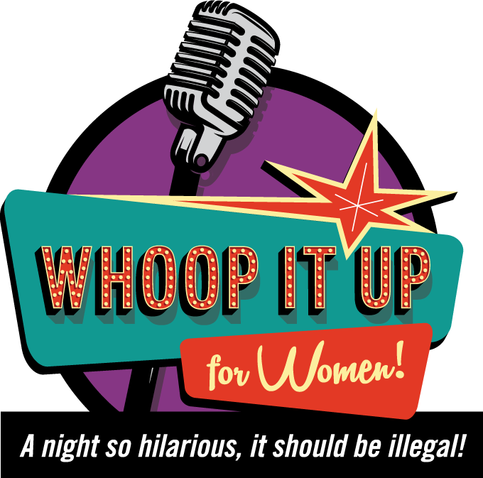
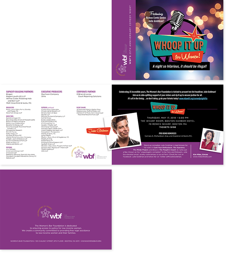
A powerful, advocacy-minded organization with a strong reputation on Capitol Hill, the Women's Bar Association of Massachusetts has established itself as a model for similar associations across the country, and required appropriate branding to reflect its might and influence. The new logo leverages the equity of their existing corporate blue, but favors stronger letterforms to establish an unwavering presence. Inspired by the symmetry of the letter "W," a proprietary take on the Scales of Justice was born to communicate the ideals of fairness and equality and to convey a deep commitment to their roots as advocates who understand that legal action effects change. WBF Committed to providing free legal assistance to low-income Massachusetts women and their families, the Women's Bar Foundation needed an identity that would communicate values of sisterhood , support, and teamwork. Additionally, the decision was made to brand the WBF's largest annual fundraiser, a comedy event, with an overarching umbrella ("Whoop It Up for Women") under which the unique details of each year's specific program will reside. Standardizing visual systems was ideal for these non-profits, as a way to improve communication and reduce costs. |
|
|
|
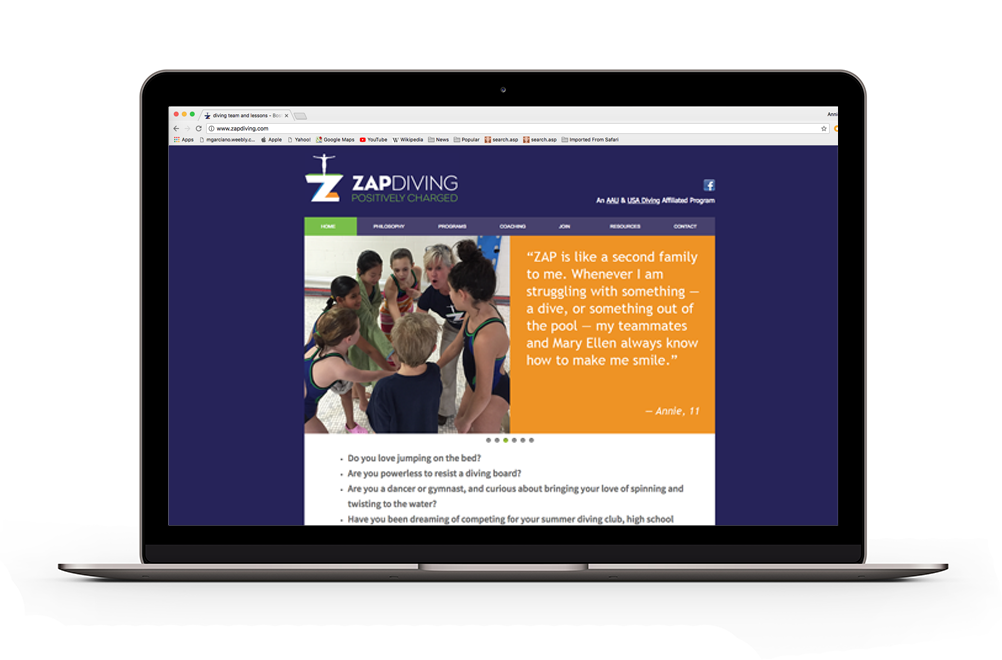
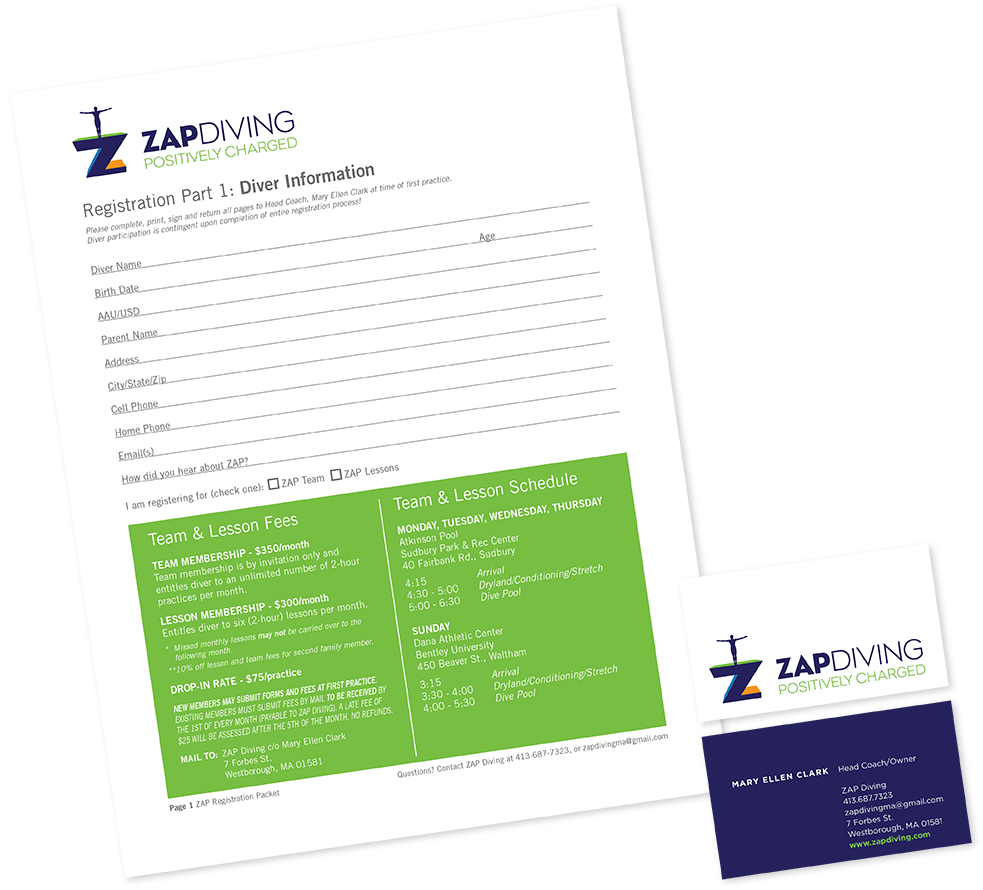
CASE STUDY: ZAP Diving
|
Client
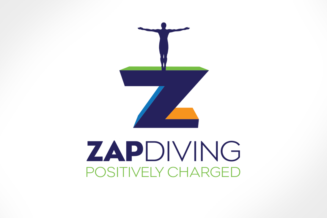
Mary Ellen Clark Scope Brand Makeover Services Brand Platforming Logo Design Web Design Copywriting Owned by two-time Olympic diving medalist, Mary Ellen Clark, ZAP Diving was a previously owned AAU and USA Diving affiliated diving club with a host of reasons to maintain its name and membership, and just about as many to abandon everything else about its branding. The existing name, an acronym for "Zest for Achieving Potential," was retrofitted with a new tagline, "Positively Charged" to connote the energizing capacity and increased potential associated with maintaining a positive attitude.
A bright, arresting new logo uses perspective to suggest the drama of standing on a platform or springboard and the aspirational moment when one is able to trust in his or herself enough to take risks. 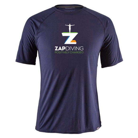
|
|